Visual Literacy -
Society
Culture
Technology
Politics
History

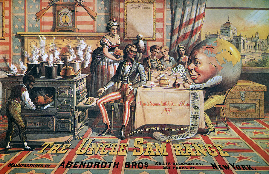
The image above looks like an advertisement and is in fact for Ranges like the one on the left of the image. Whereas the image below does not, it looks more like a piece of art to hang on the wall. Bold font stands out of the image and looks more serious and business like than the other. You can see that the image is trying to sell and therefore looks fake and set up everything sends a message in the picture the big message is AMERICA. Everything about the image screams that America is helping out the world and that it is a big power feeding the world. Speaking of the world you can see the not so subtle symbol of the earth reading through a list and looking at what other countries bring to the table. This also shows off the wealth of America and all the countries on the list. There is a sign of the times and inequality in the image showing the woman and the black boy serving food to all the countries. The first image is made to look organised straight to the point and convey a strong message that America is feeding and is providing for the rest of the world as if it's bringing it together showing they are already organised and well off living life how they are.

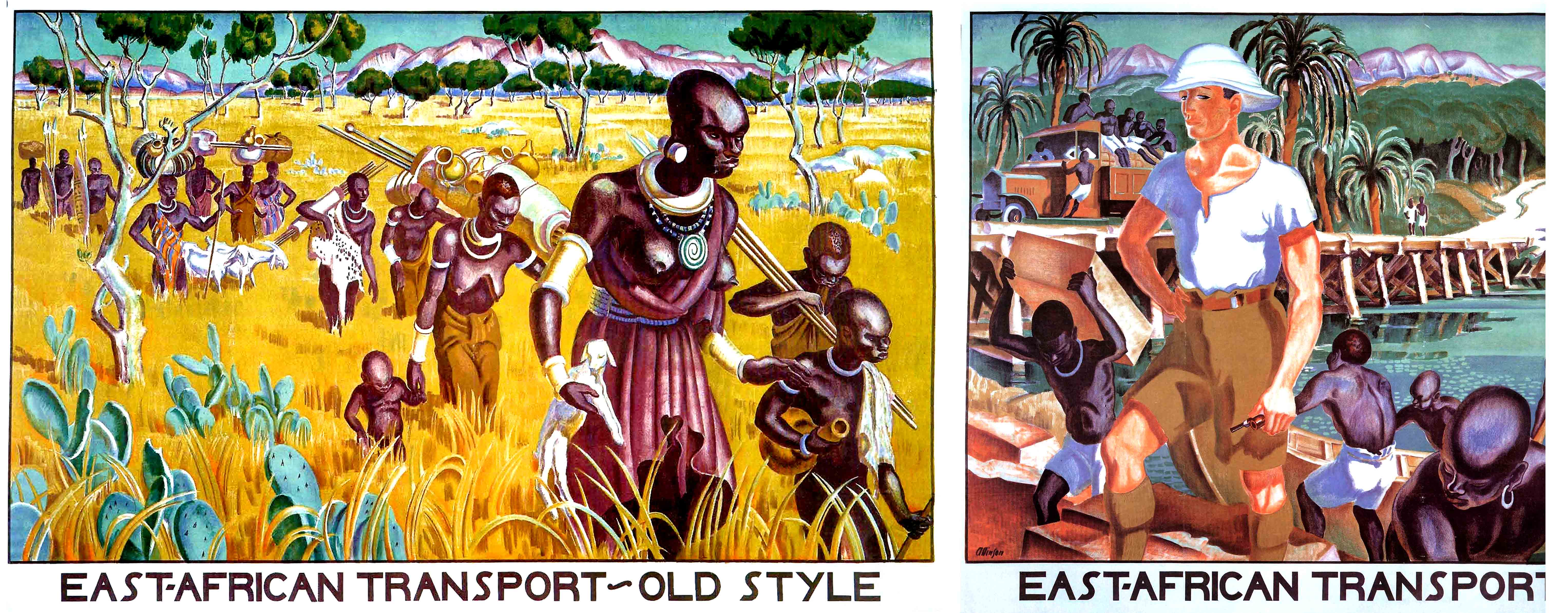
This image compared to the top image shows a whole different idea. The first image is made to look un organised, the people are made to look unhappy and tired. The image holds a lot of false truths and looks to be aimed at white people. The Typeface like the first image is clear and bold but it has been made to stick with a kind of traditional African design to keep it looking authentic. The second image is meant to convey a sense of order everyone looks happier, well you can't actually see the black peoples expressions but it's meant to be aimed at white people to say that this way is much better. There are no woman or children in the second image unlike the top image where children are sat around the table and a woman is serving, in this image they're saying it's better for the woman and children as they no longer have to carry the loads. Like the first image there are black people being used to work and a bit more un subtle than the first this image quite clearly shows the white man on top and higher up than all the black people looking pleased. Comparing the two images is meant to make you decide that the right hand side is the better way and it should be done. Comparing it to the top image you can see that the way the image has been made is completely different, the top looks like it has been made to be printed in a newspaper to advertise for the company whereas the bottom looks like a piece of art and you wouldn't see it in a newspaper.
No comments:
Post a Comment